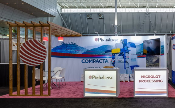
Designing a trade show booth requires careful consideration of all types of design elements, and your use of space is one of these.
When you are planning your design, you need to use space wisely. One common mistake we see in our clients is the desire to stuff as much as possible into the space.
While this feels like an effective use of space, it can actually make your booth less effective.
Here’s a closer look at how you should, and should not, fill your exhibit space.
Leave Room to Move
You do need a lot of items in your exhibit space, but you also need to leave your booth visitors and your team members room to maneuver the space. You want your guests to be engaged with your booth, and in order to do that, they need to be able to move around, view your products and listen to your presentation.
Putting too much furniture, shelving, and display elements into your booth will limit the ability to move, and this can limit your engagement.
As you plan your space, plan the routes that visitors will take as they maneuver it.
Make Wise Layout Choices
As you look at your layout choices, be wise in your decisions. Here are some factors to consider:- TABLES – Tables can be viewed as barriers, keeping event staff and attendees from properly engaging with your booth. They are also quite wide, and that makes it more difficult for conversations between your team members and attendees to develop naturally.
- CHAIRS – Unless you have lengthy conversations and presentations, chairs can be a distraction rather than a convenience. Your staff may be prone to sitting more than they should, which can limit engagement.
- THE EVENT SPACE – Your goal should be to have your booth segue well with the event space, “becoming one,” if you will, with the exhibit hall. An open design that naturally draws foot traffic in is part of this, and open designs make your booth less claustrophobic.
Even with these three considerations, you also need to consider your goals. For example, you may think you need a table in order to be able to offer demonstrations, but instead, you could invest in a functional counter that is tall and narrow.
This creates less of a barrier and doesn’t distract from conversations, but still gives you the work space you need.
Similarly, you may need a seating area for negotiations and closing the deal, but instead of a lot of chairs, just have one table and chair set off to the side.
Remember, you have many choices for your layout, and some may seem beneficial at first. Yet if you’re filling every inch of your exhibit space, those benefits will be minimal. Instead, leave space to encourage foot traffic and maximize the items that you do bring into the trade show booth.
Get the Right Help to Build Your Event Space
Whether you have a lot of space or a little space, partnering with an experienced exhibit house will help you maximize it. Exhibit Options is ready to assist. Our design team will help you consider all of these factors so you can make the most out of your event space, ensuring your visitors feel comfortable and your staff can effectively interact with showgoers.
Contact us today to start building your trade show booth with the help of an experienced, knowledgeable design team.


COMMENTS