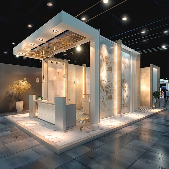
Design principles aren't just for graphic artists or interior designers; they're crucial for creating effective trade show exhibits as well. The right design can elevate your brand, guide visitor flow, showcase your products perfectly, and create inviting meeting areas. It's about more than aesthetics; it's about using design to communicate your brand's message, engage with your audience, and achieve your trade show goals. From color theory and layout to lighting and graphics, every design choice plays a pivotal role in the success of your exhibit.
Let’s take a look at some essential Design Principles that apply to trade show exhibits.
1. Balance and Proportion:
Balance in design ensures that no single element overwhelms the others, while proportion ensures that elements are sized appropriately relative to each other. For trade show exhibits, this might mean balancing branding elements with informational content or ensuring product displays don't overshadow interactive areas. Proper balance and proportion make your booth inviting and prevent visitor-overwhelm.
An example of balance and proportion in a trade show exhibit could be the arrangement of digital screens and physical product displays. Imagine a booth designed with a central, large digital screen showing dynamic content, flanked on either side by equal-sized product display areas. This symmetry not only creates a visually pleasing balance but also encourages visitors to explore both sides equally, ensuring that all products receive attention.
2. Unity and Harmony:
Creating a cohesive look and feel across your booth is vital. Unity in design can be achieved through consistent use of brand colors, fonts, and imagery, ensuring every element from banners to brochures feels part of the same family. This harmonious design reinforces your brand identity and aids in brand recall long after the show.
Consider a trade show booth for an eco-friendly brand that uses a consistent palette of natural greens and browns across all elements, from the graphics on the backdrop to the staff uniforms. The materials used for the booth, such as reclaimed wood for the display stands and recycled materials for the brochures, further reinforce the brand's commitment to sustainability, creating a harmonious message that resonates with visitors.
3. Contrast and Emphasis:
Utilizing contrast can draw attention to key areas of your exhibit, such as new product displays or demonstration areas. Whether through color, lighting, or structural design, contrast ensures that these focal points stand out. Emphasis on important elements ensures they're noticed by visitors, guiding their journey through your booth.
A tech company might use high-contrast colors, like black and neon green, to draw attention to their latest product. By designing the product display with a spotlight effect against a darker background, the product naturally becomes the focal point of the booth. This strategic use of contrast ensures the product stands out, attracting visitors' attention amidst the bustling trade show environment.
4. Rhythm and Movement:
Design can guide visitor flow within your exhibit. Rhythm in design, created through patterns or repeated elements, can subconsciously direct visitors along a desired path, leading them through product displays to interactive stations and finally to meeting areas. Effective use of rhythm ensures a natural, engaging visitor experience.
A booth designed with a clear, linear path that leads visitors from the entrance through a series of interactive stations, each showcasing different aspects of the service offered, creates a rhythm that naturally guides visitors. Along the path, repeating patterns of light and color could further direct movement, subtly leading visitors to the consultation area at the end of the booth, ensuring a smooth flow of traffic and engagement with each element.
5. Functionality and Accessibility:
Design must always serve function. Every element of your trade show booth should be designed with purpose, whether it's to inform, engage, or entertain. Additionally, ensuring your booth is accessible to all visitors, including those with disabilities, is crucial. This means considering factors like layout spacing, height of displays, and ease of interaction.
A booth incorporating multiple levels of interactive displays, from touchscreens placed at wheelchair-accessible heights to elevated product shelves for easier viewing, exemplifies functionality and accessibility. Designing interactive elements with clear, easy-to-read fonts and providing headphones for audio presentations can cater to visitors with varying needs, ensuring the booth is welcoming and accessible to everyone.
Design Your Way to Trade Show Success with Exhibit Options
Leveraging these design principles can transform your trade show exhibit from just another booth to a powerful brand experience. It's about creating a space that's not only visually appealing but also strategically designed to engage visitors and leave a lasting impression.
At Exhibit Options, we specialize in creating trade show exhibits that combine aesthetic appeal with functional design to captivate your audience and achieve your marketing objectives. Let's collaborate to make your next trade show exhibit a resounding success.


COMMENTS