SPECIFICATIONS:
- Booth Size: 46,000 Sq. Ft.
- Type of Exhibit: Meeting Spaces at Anaheim Marriott
- Show: Shaklee Global Conference
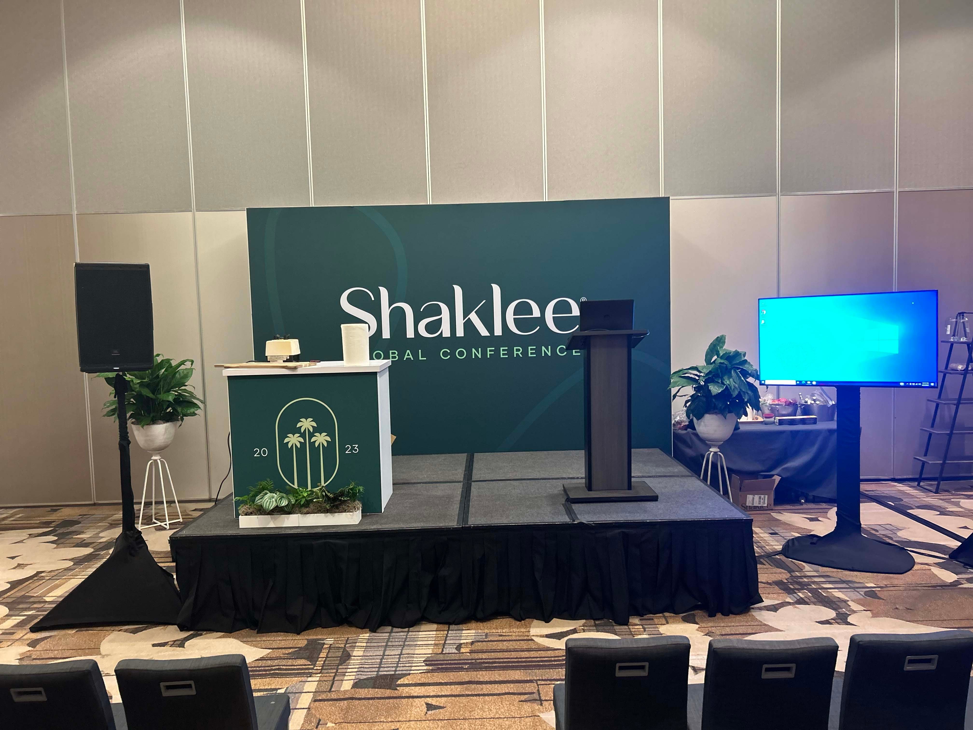
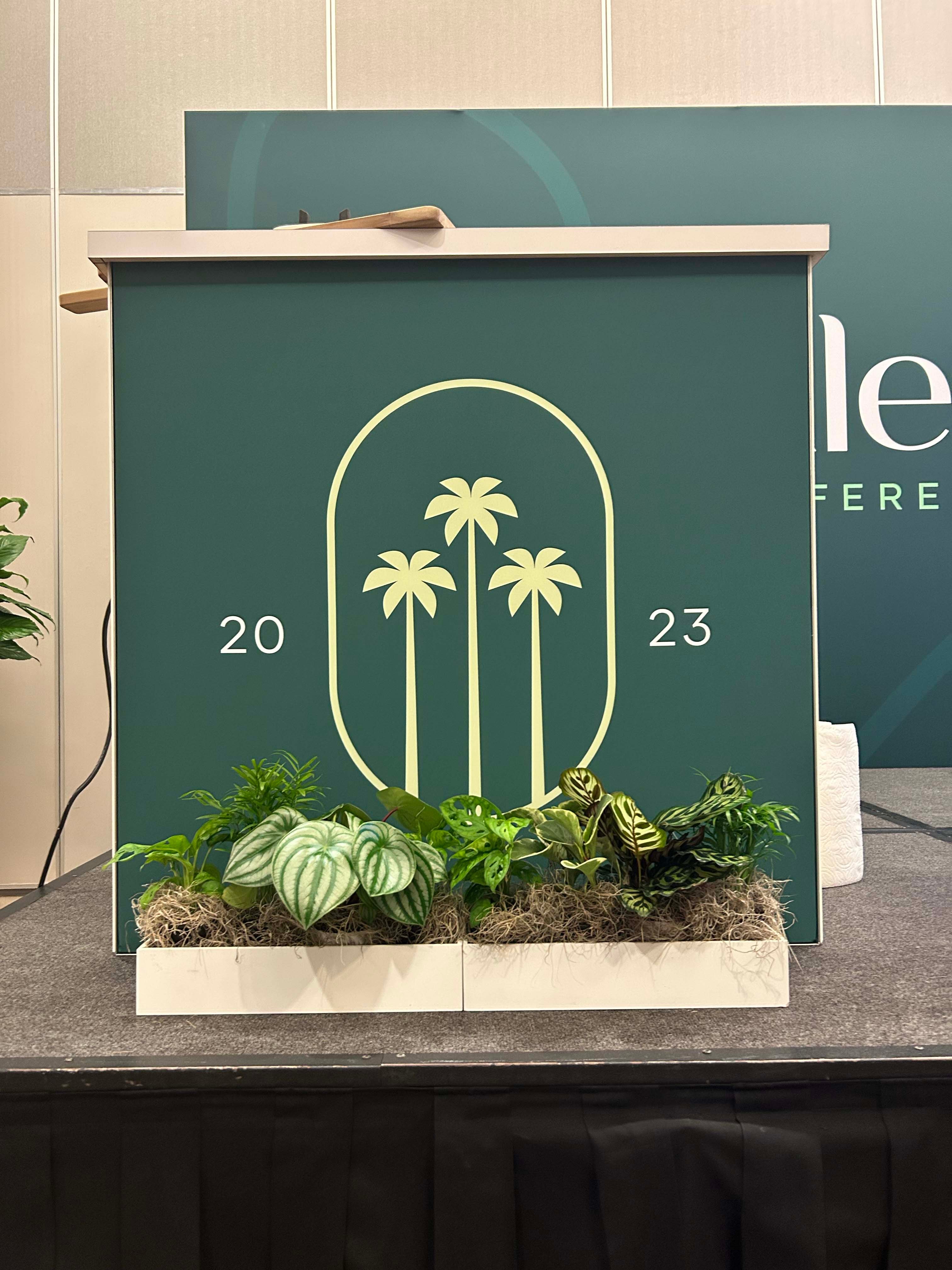
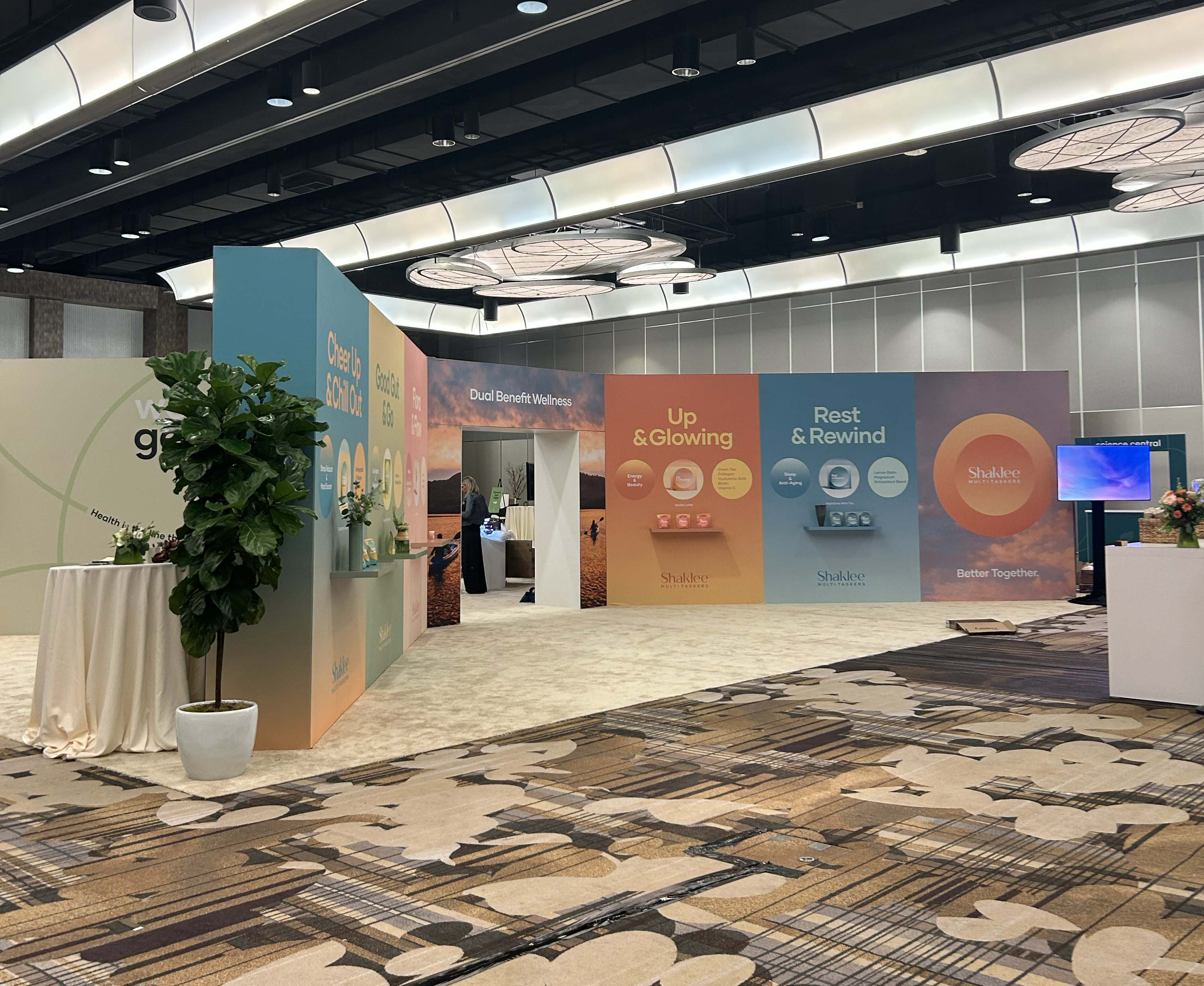
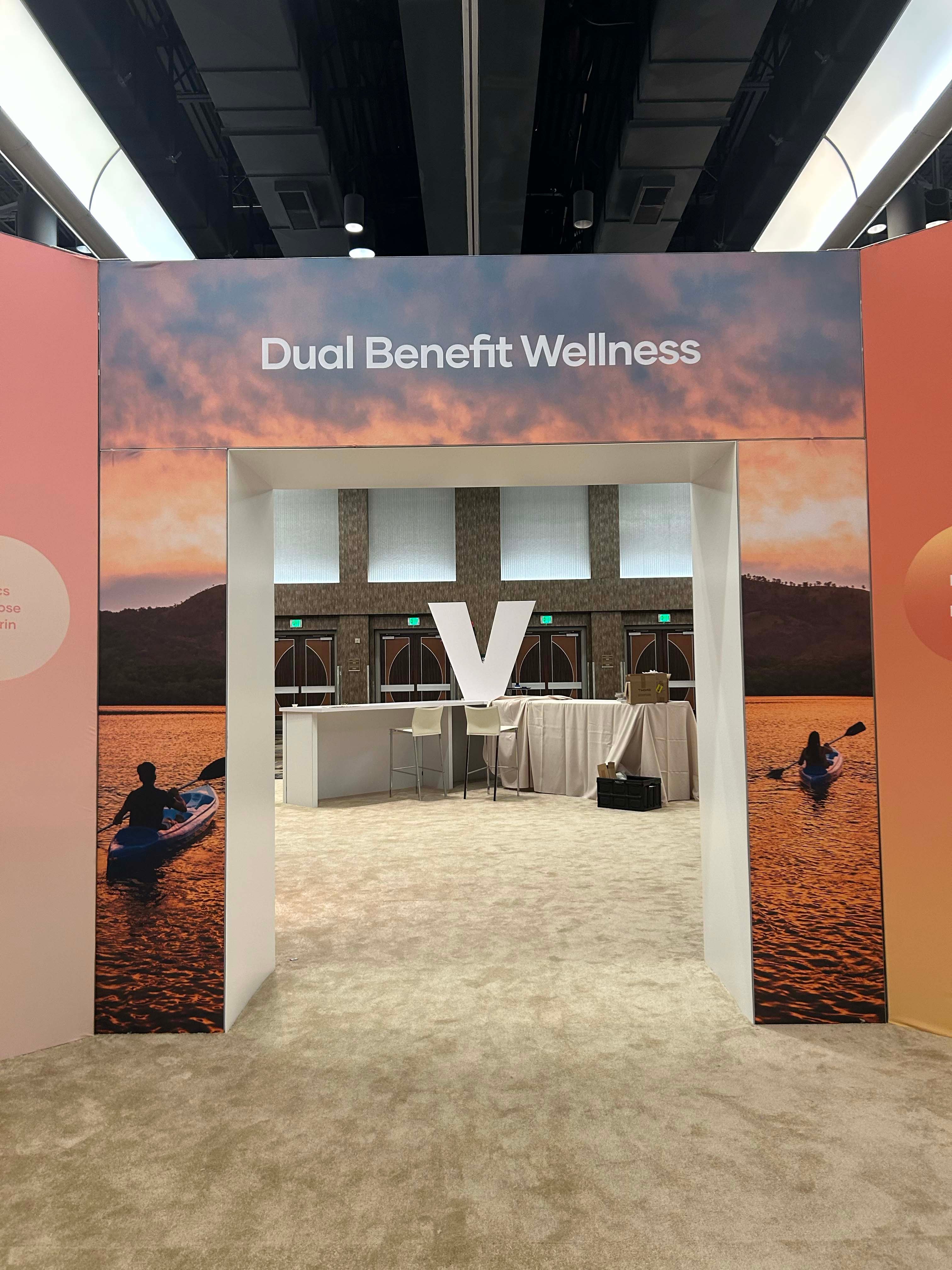
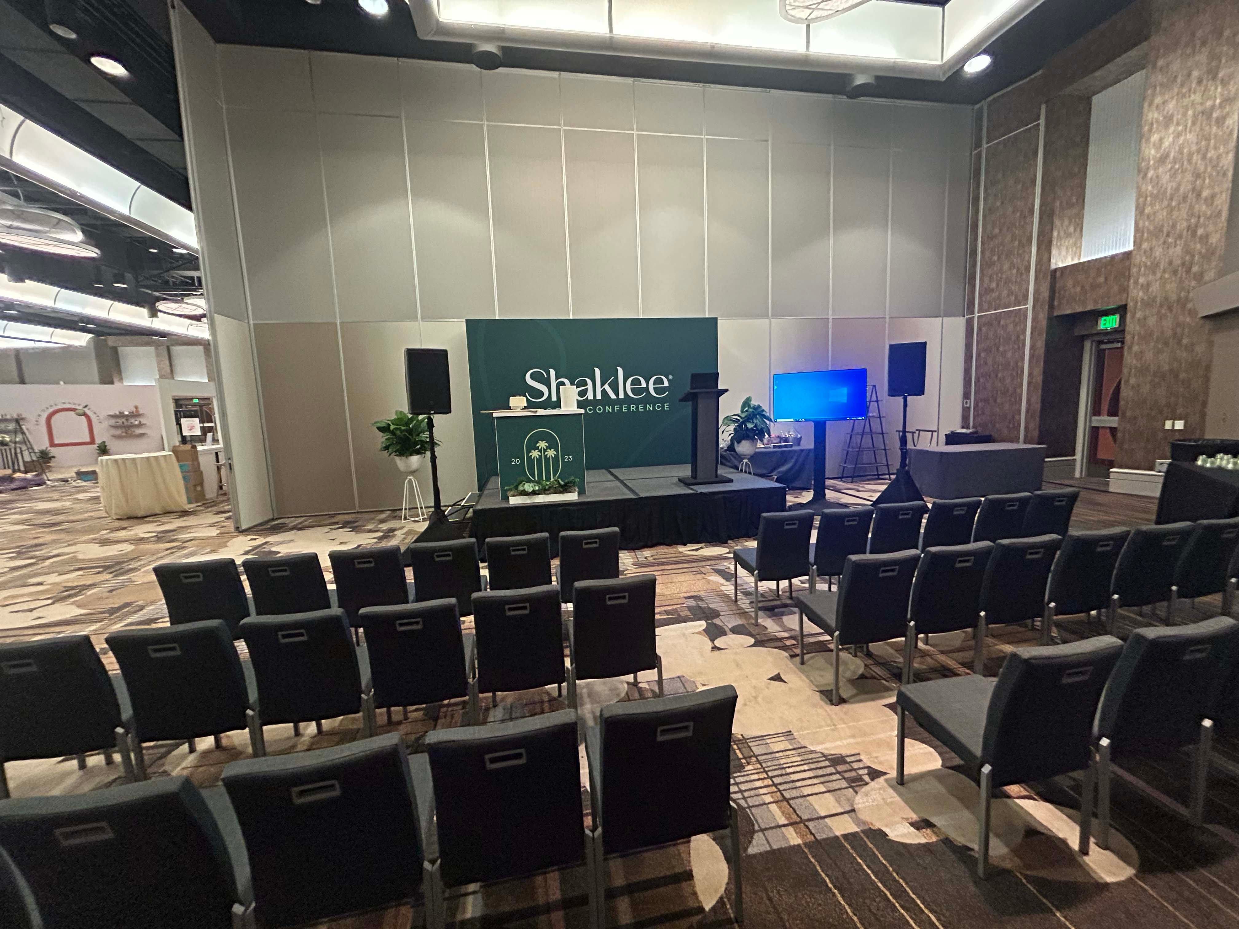
Shaklee, a prominent name in the wellness and health industry, is a company that has been dedicated to improving people's lives through natural products for decades. With a commitment to sustainability and holistic well-being, Shaklee offers a wide range of products that encompass nutrition, beauty, and home care. In line with their values, Shaklee sought to create an exceptional experience for their Global Conference, and to achieve this, they faced a series of challenges.
Let's explore the challenges faced during the large scale custom build and the innovative solutions employed by Exhibit Options to meet Skaklee's vision.
CHALLENGE:
The challenge for Exhibit Options lay in designing and building various custom meeting spaces that could accommodate Shaklee's global conference requirements with just 1 day for installation before event opens.
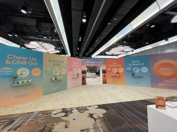
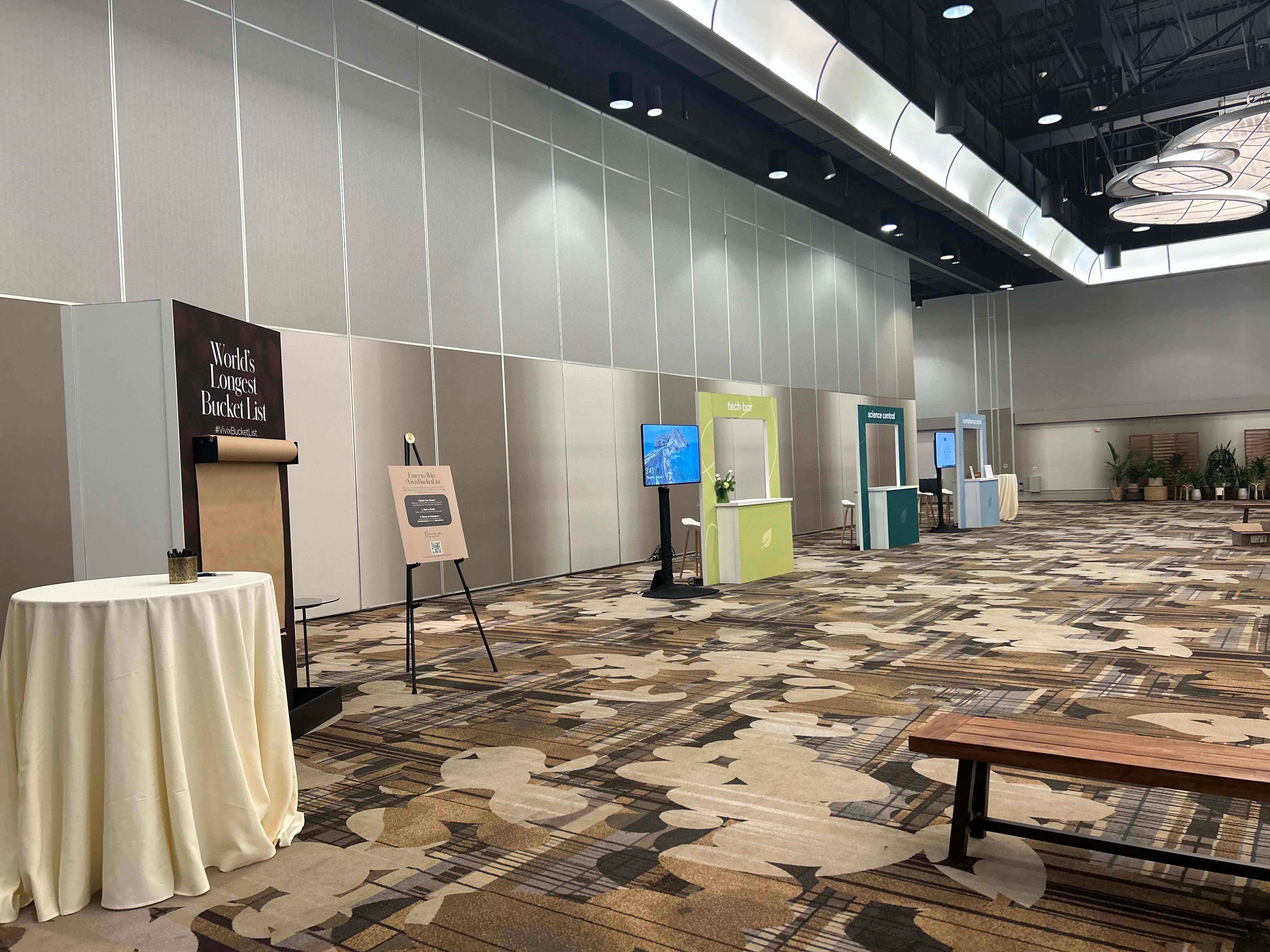
Spanning an impressive 46,000 square feet within the Anaheim Marriott, this project involved several distinct rooms: a Registration area, the Main Hall, a Presentation Room, and even a Retail Store. The diverse functionalities of these spaces demanded a creative approach that could seamlessly integrate brand representation, experiential engagement, and aesthetic appeal.
Here's how we pulled off the build!
Have your own challenge? We can help.
SOLUTION:
Exhibit Options embraced the challenge by developing a multifaceted solution that catered to Shaklee's diverse needs.
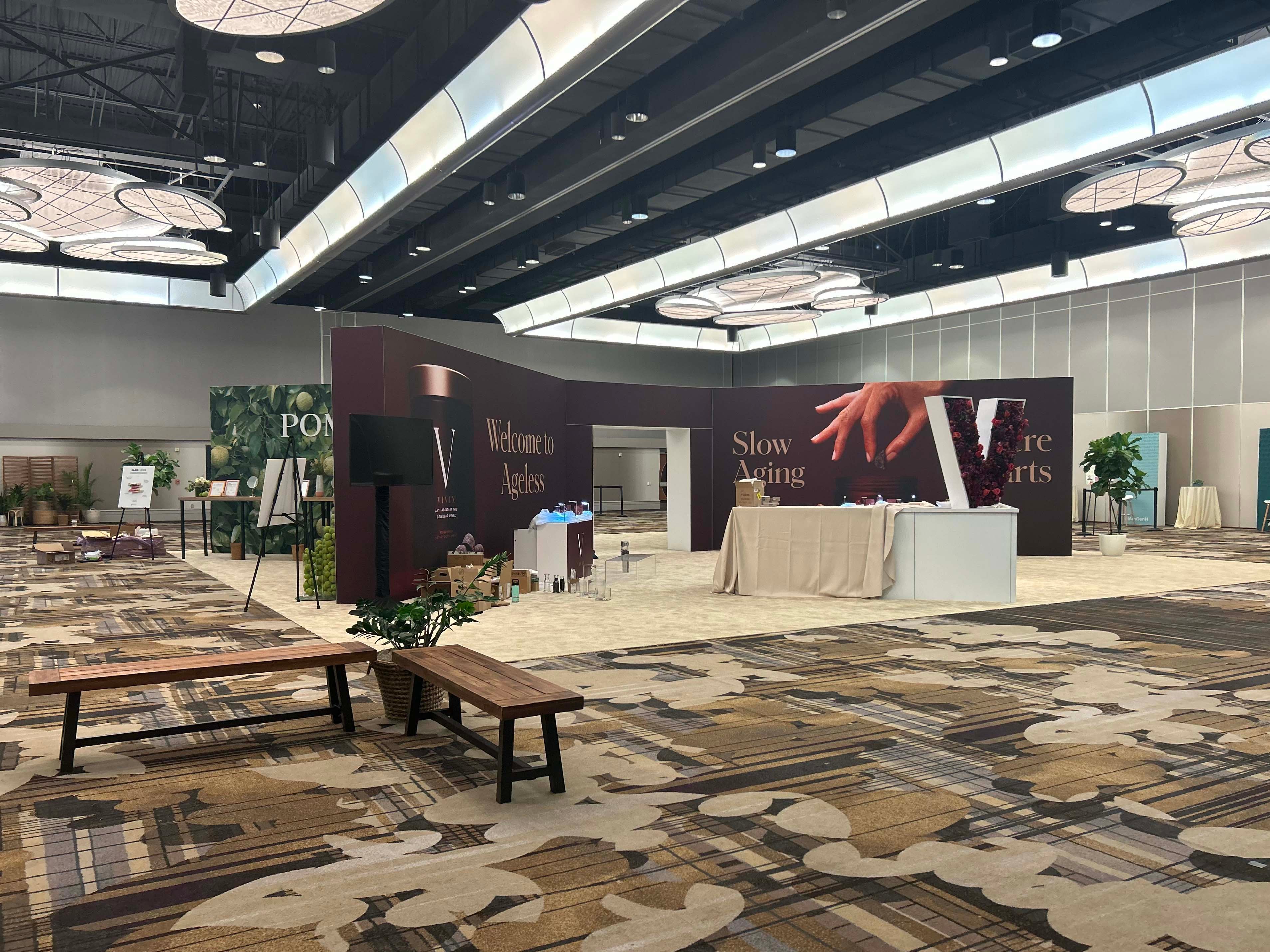
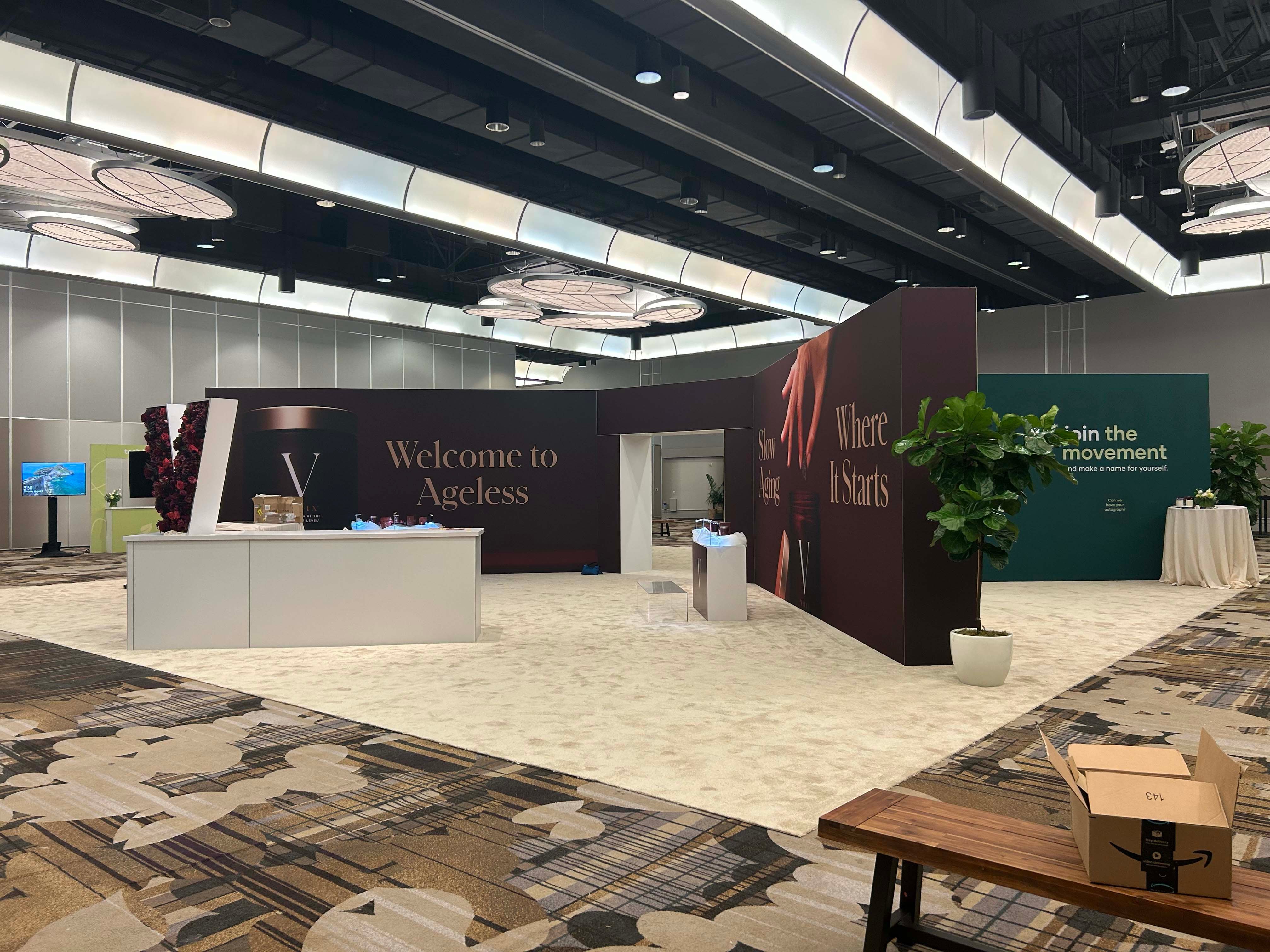
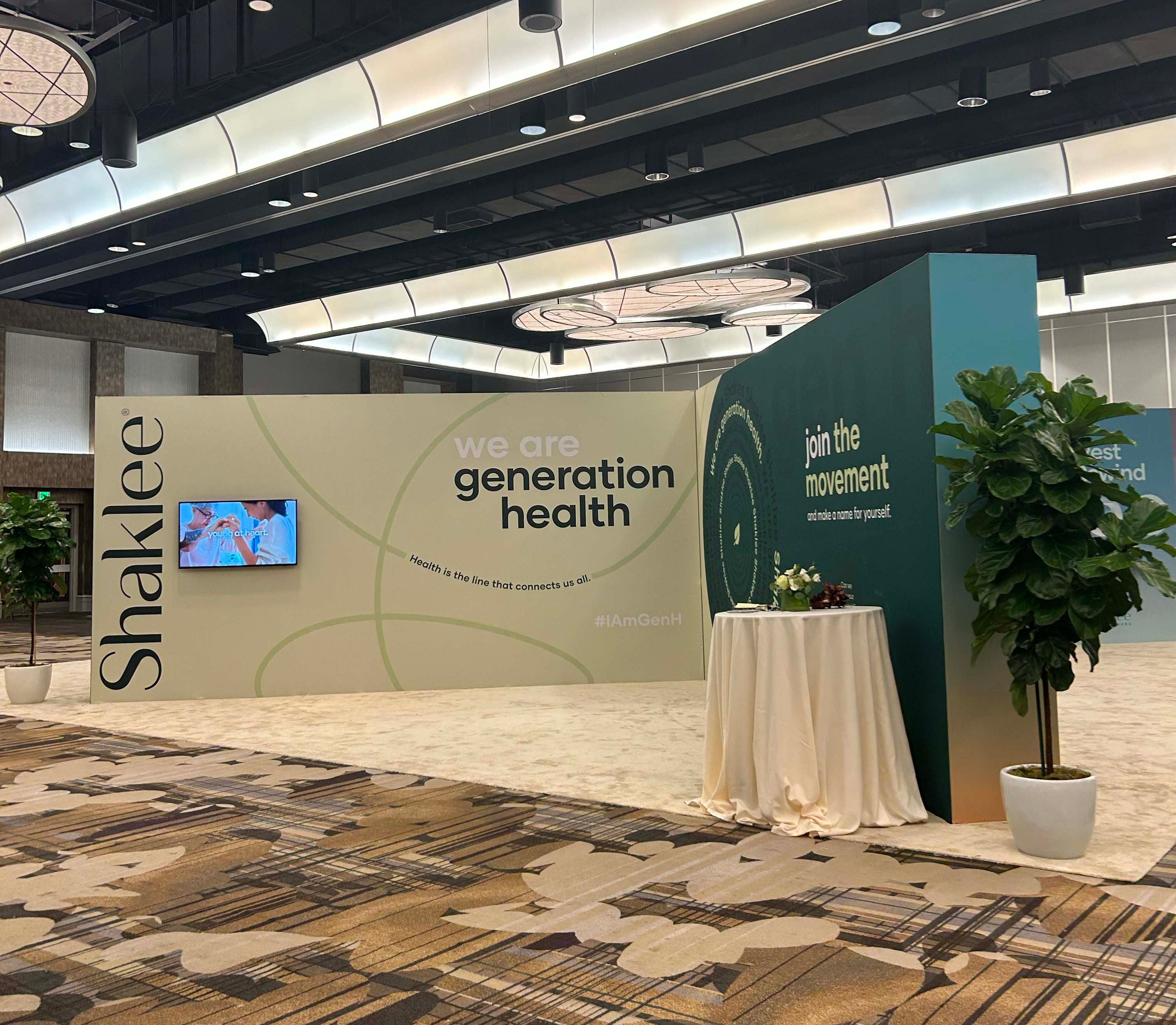
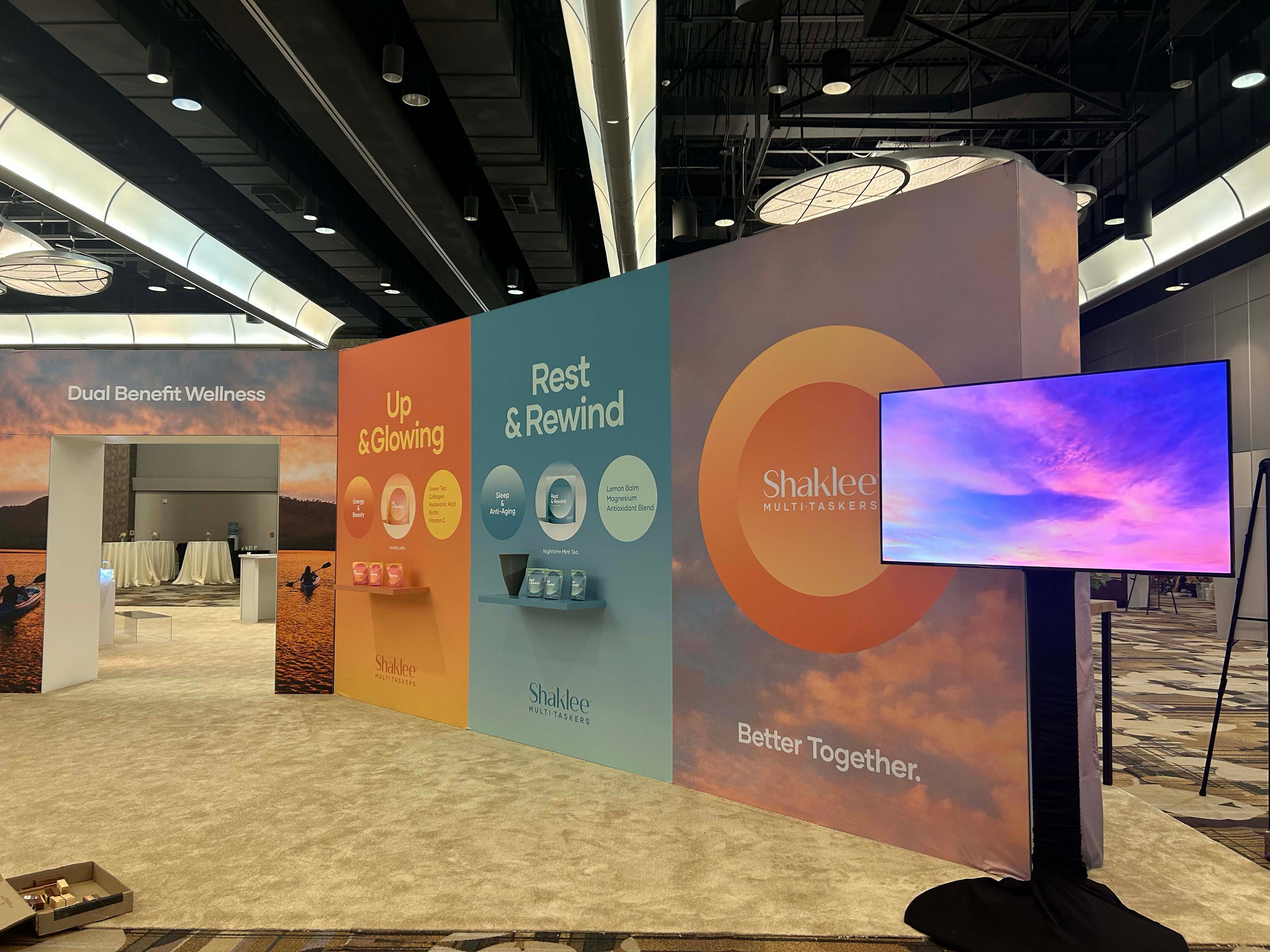
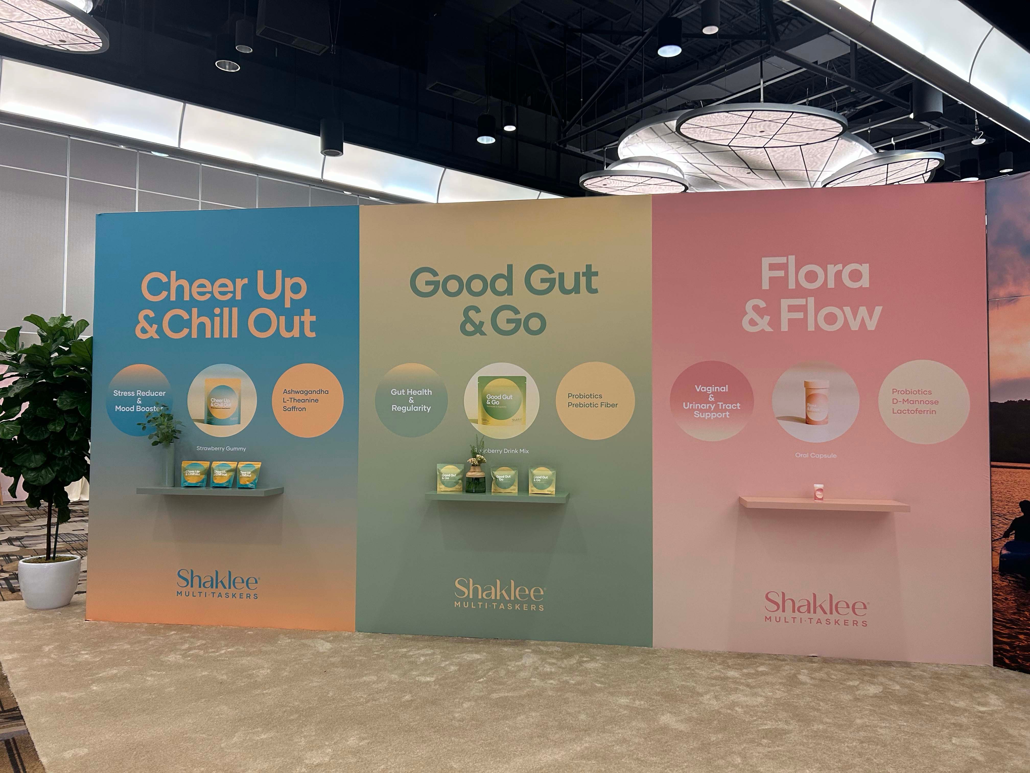
The heart of the event, the Main Hall, was designed to be a captivating focal point. At the center stood a monumental "X" tower, an awe-inspiring 42-foot-long and 10-foot-high structure that acted as a testament to Shaklee's commitment to their multiple brands. Each side of the "X" was dedicated to a specific Shaklee brand, brought to life through SEG fabric graphics, engaging floating shelves, and innovative backlighting to ensure a stunning visual impact.
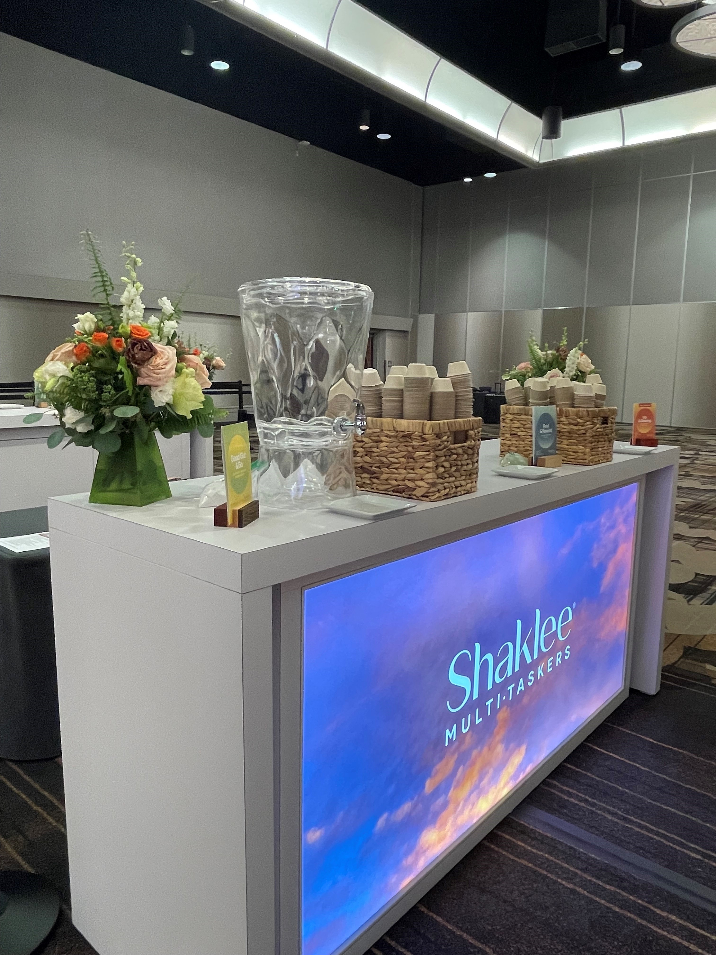
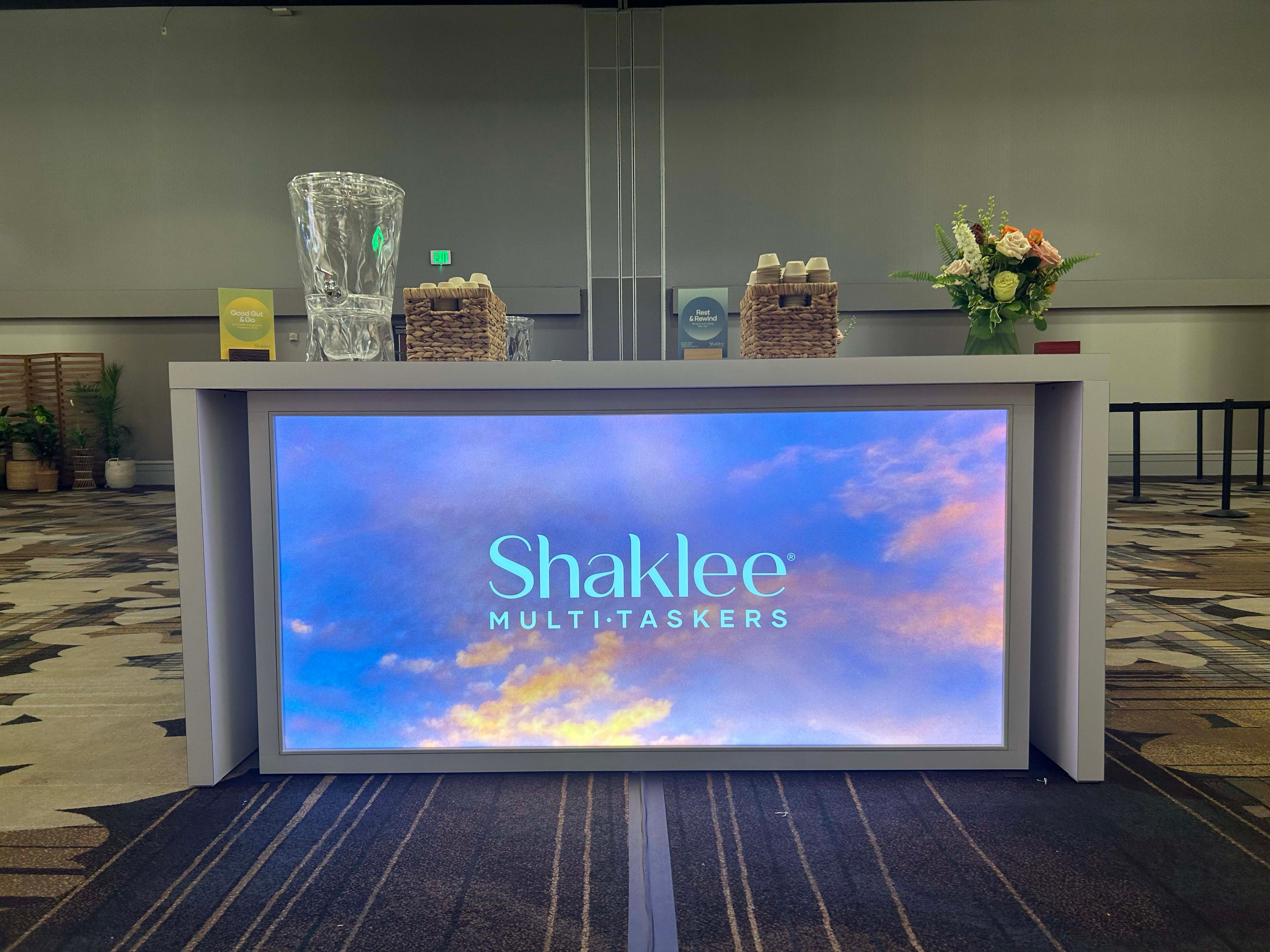
To elevate the experience further, Exhibit Options introduced functional elements like backlit counters that served as refreshment stations, enhancing convenience for attendees. The incorporation of selfie stations and dedicated information booths facilitated engagement and networking. One particularly unique feature was the "Bucket List Wall" featuring a Kraft paper roll where attendees could jot down their dreams and aspirations, fostering a sense of community and inspiration.
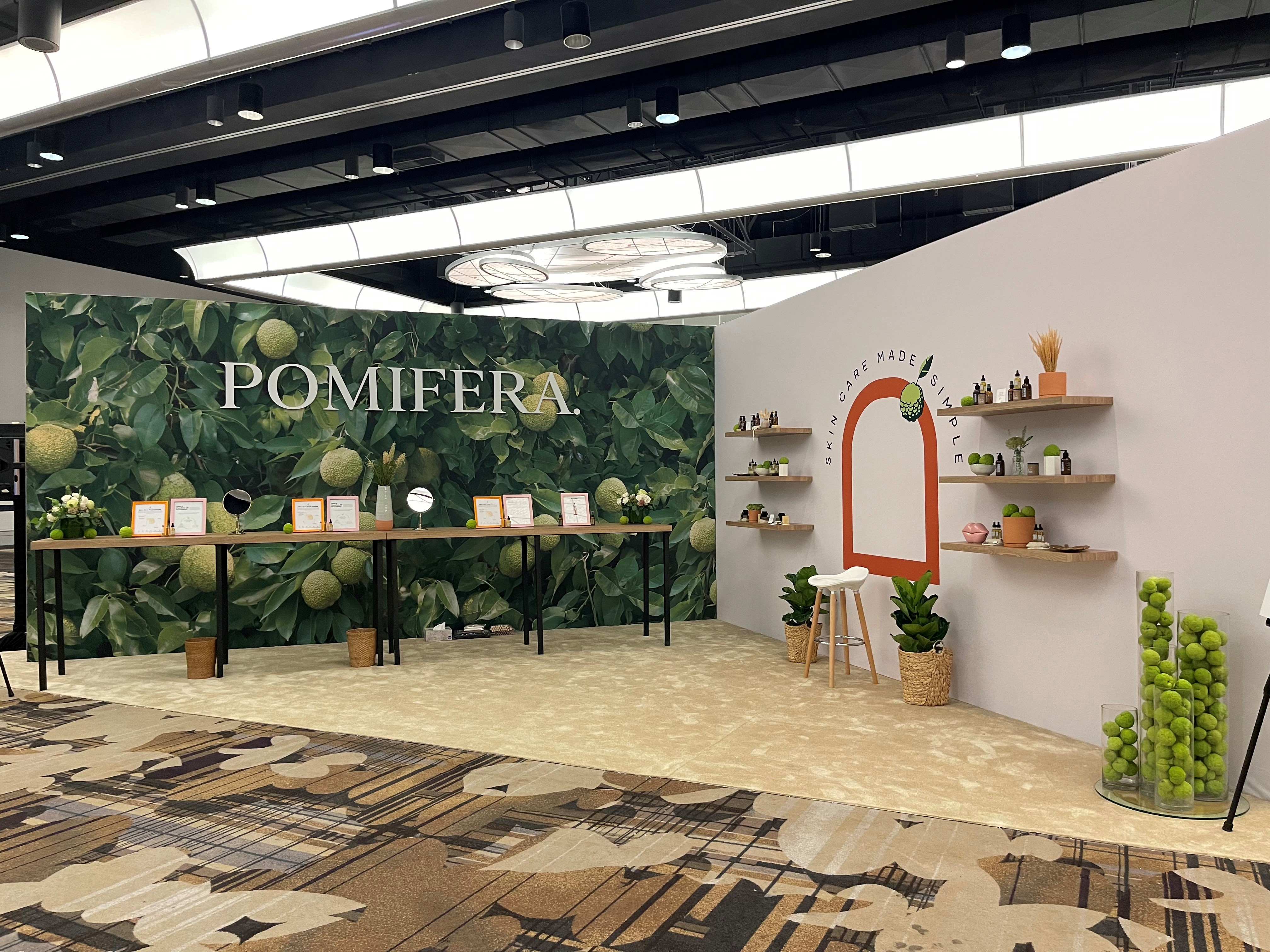
For specific brand representation, we meticulously crafted a 3D logo for Shaklee's brand "Pomifera." This attention to detail not only showcased the brand's identity but also displayed Exhibit Options' proficiency in translating a vision into a tangible, striking design.
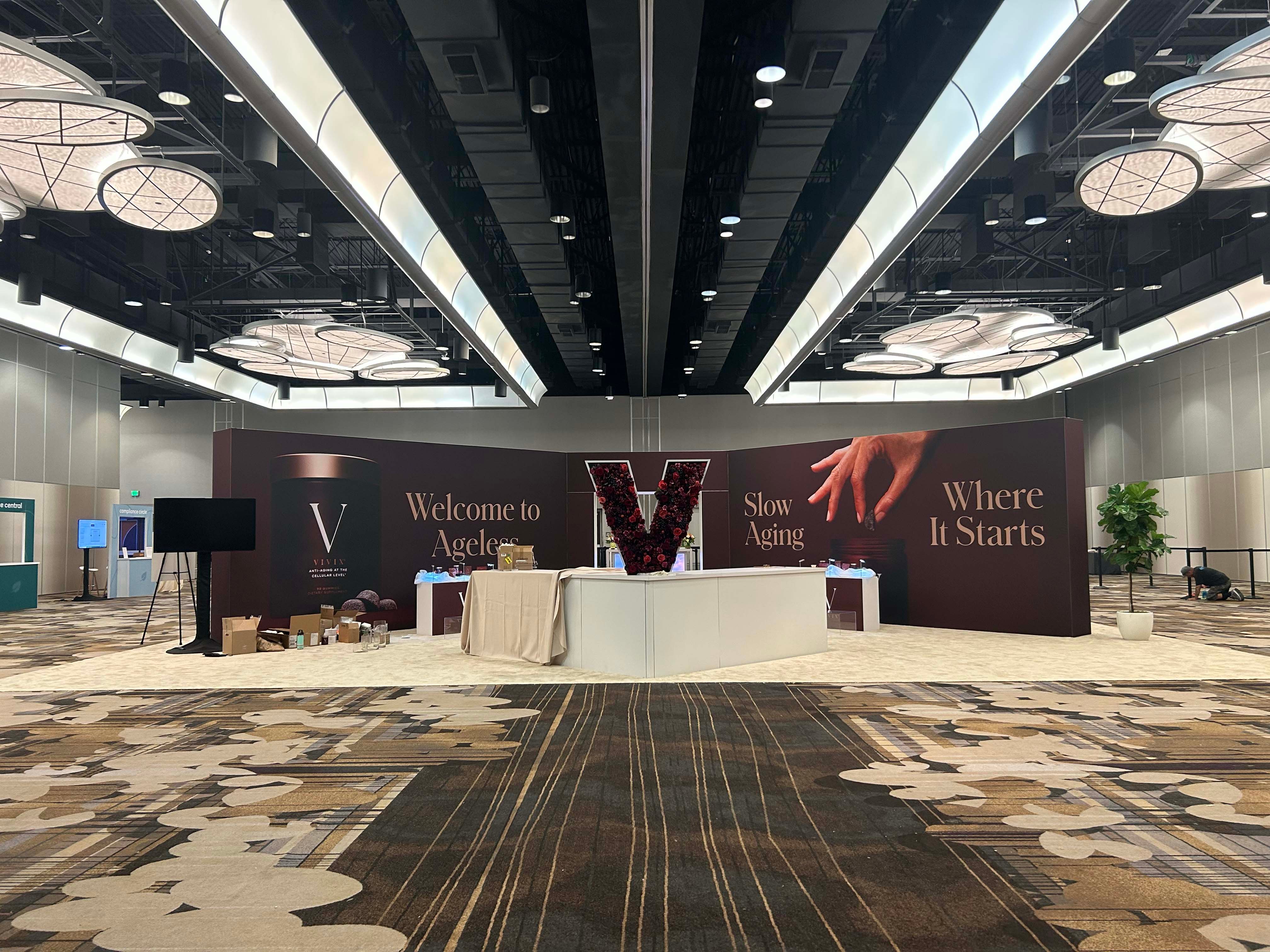
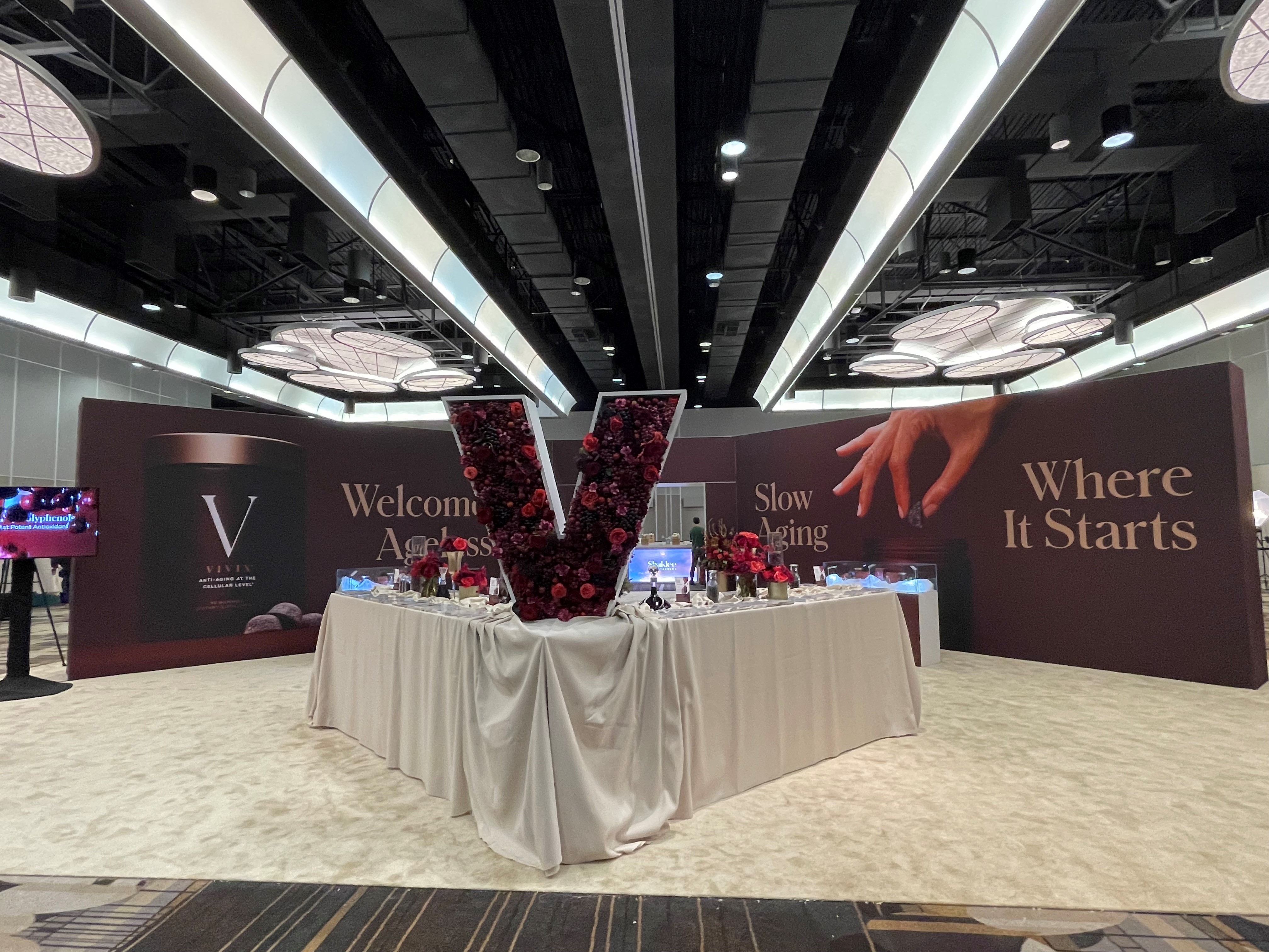
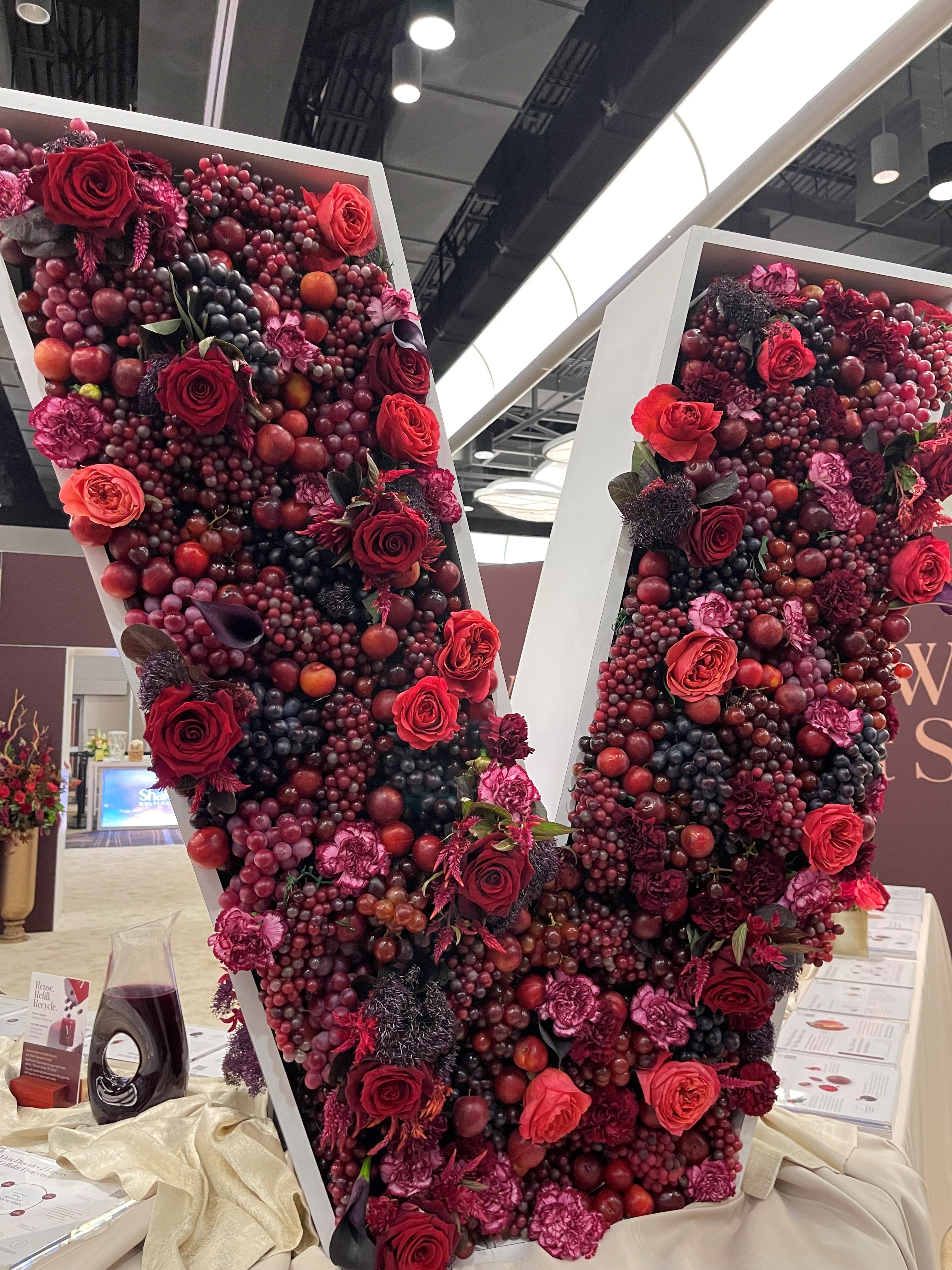
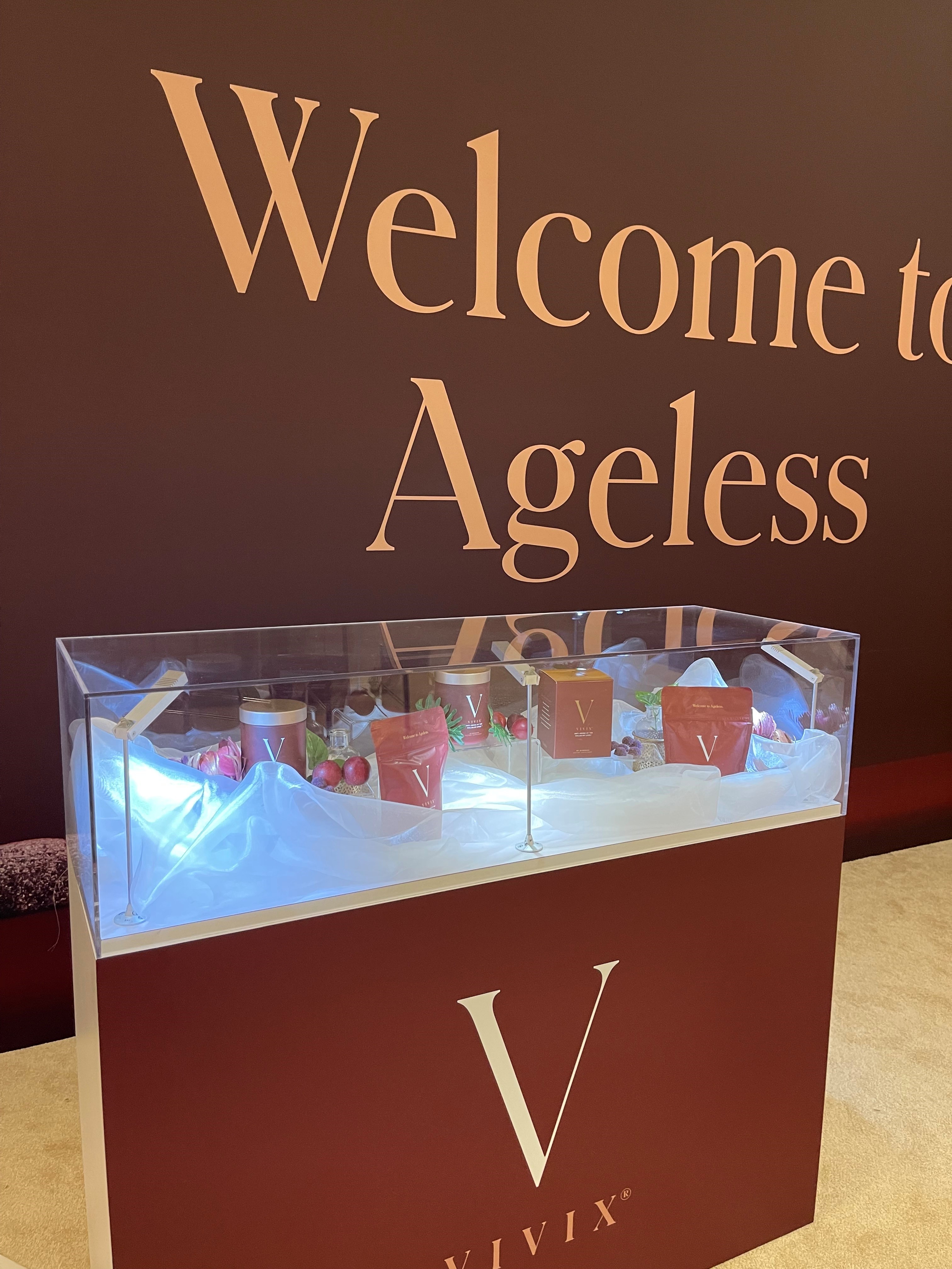
The inclusion of natural elements was another key aspect of the solution. A center V counter on the Vivix side included a custom wood hollow letter "V", adorned with live plants, flowers, and fruits, not only represented Shaklee's commitment to natural wellness but also brought an organic and refreshing atmosphere to the space. Seating benches and strategically placed plants ensured both comfort and aesthetic harmony.
Incorporating AV technology seamlessly, Exhibit Options ensured that the audiovisual requirements for presentations and immersive experiences were met. This technological integration complemented the overall design, creating a cohesive and engaging environment for the conference attendees.
The final product turned out great!

