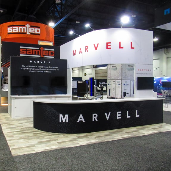
SPECIFICATIONS:
- Booth Size: 20x20
- Type of Exhibit: Custom Island Booth
- Show: Super Computer
CHALLENGE:
Marvell wanted their 20x20 Island exhibit to be cohesive with their brand image; a black and white color scheme with a straightforward design. It was also important that:
- The booth required enough space to showcase their products.
- Use straightforward designs and colors to stand out at a computing event.
Have your own challenge? We can help.
SOLUTION:
Instead of using a single color for the design, we decided to create as much contrast as possible. Using a wooden floor as a base, we strategically mixed the black, white, and red colors all throughout the booth.
We also incorporated a large double-sided, curved logo header to draw attention to the booth, and paired it with an over-sized curved counter to not only catch people's eyes, but have the needed space to display their products.
Having the over-sized counter allowed us to set up 4 workstations, for the one-on-one demos, and conversations that Marvell was wanting.


